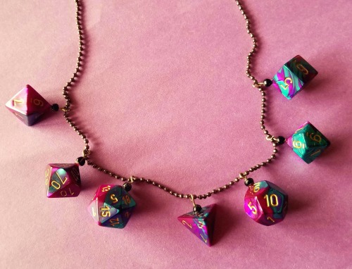
One of my players made me a dice necklace out of the dice he’s been using for months, as a thank you for putting up with him all these years, and I don’t have the heart to remind him that those were dice I loaned him that I kind of wanted back.
On one hand, it’s pretty cool, but on the other hand, *Borat voice* My Dice.
Everyone’s like, “Oh, they’re just cheap Chessex dice, dude. Calm down,” but you don’t understand. I have to buy like three fucking sets of dice a month because these little shitheads keep losing theirs and no way in hell am I trusting them with my Good Dice. I have a fanny pack full of dice that I wear to sessions because these fools suck so bad. I honestly think they’re eating them. I think they’re skipping them across lakes. I think they’re fucking tossing them at windows in the pouring rain to get their unrequited lover’s attention. I give these motherfuckers so many of my dice that they could hike the Appalachian Trail and leave dice behind like breadcrumbs. They probably pour buckets of my fucking dice under their tires like kitty litter to gain traction when they’re stuck in the snow. And I know they aren’t just keeping them because they’ll literally lose them mid-session. Like there’s a black hole under the coffee table. It’s an X-File at this point. It’s beyond an X-File. My dice are probably in The Black Lodge. My dice are in The goddamn Upside Down. They’re in The Uknown. They’re in the Additional Paranormal Pop Culture Reference, y’all.
art is learnign a shit ton of small facts. like, a cat’s back kind of goes like this. or, if i draw a line on an arm like this it looks like a muscle. or even like, if u draw shit small it looks like it’s far away. really good artists just know SO MANY facts. and theyve had time to practice them until its automatic. but like. u can learn facts. thats the only difference between u and ur art heroes.
Posted on
some more colour theory. colours are a pain in the ass because theyre all different.
like, no matter what you do, a shade of blue and a shade of yellow w/ the same computer brightness number, the blue is going to look darker. because blue is darker than yellow. (im talking like, dark blue here. not cyan. cyan is light)
the sun’s light is yellow, so yellow highlights + purple/blue shading tends to look more natural. but really do whatever you want i hate that one post that tells you what to shade colours with. that being said you should try to shade everything being lit w the same light the same colours, so they look like theyre in the same place
saturation for lights/shadows is. interesting. technically, for realism, highlights are less saturated and shadows are more saturated. BUT. the human eye, ur night vision can’t see colour. so if it’s that dark, it’s not saturated at all. also super saturated highlights are really fun imo.
¯_(ツ)_/¯
yellow is a pain in the ass because it’s too light. when colouring a yellow thing u should suggest yellow rather than actually use it a lot. like, have a lot of yellowish brown, yellowish orange, etc, then use actual yellow less than with other colours, but in the most important spots if that makes sense?
green is like yellow but better kind of. again u should suggest green rather than actually use green that much. u can use more actual green than you can yellow though.
i love red brown and purple, they are my friends
blue is a pain in the ass to shade. god. i keep trying to shade with blue but blue on blue doesnt have a nice hue shift. and nothing is darker than blue so i cant really use anything else w/o it taking over. and when i highlight with yellow it just goes green. blue is great for highlights, contrast, very dark shadows tho. love blue. wish i could draw with it
anyway this is just my style, do whatever you want in your art, have fun, if it looks good rules dont matter